Border Honey

Branding a local taste of honey

Border Honey Eat Marketing

The brief

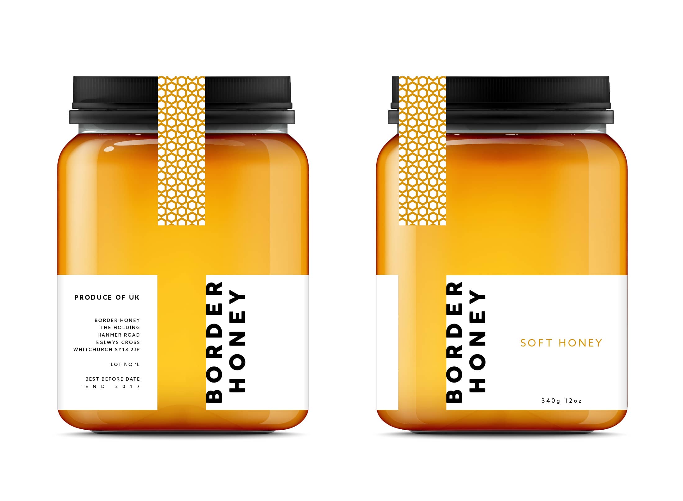
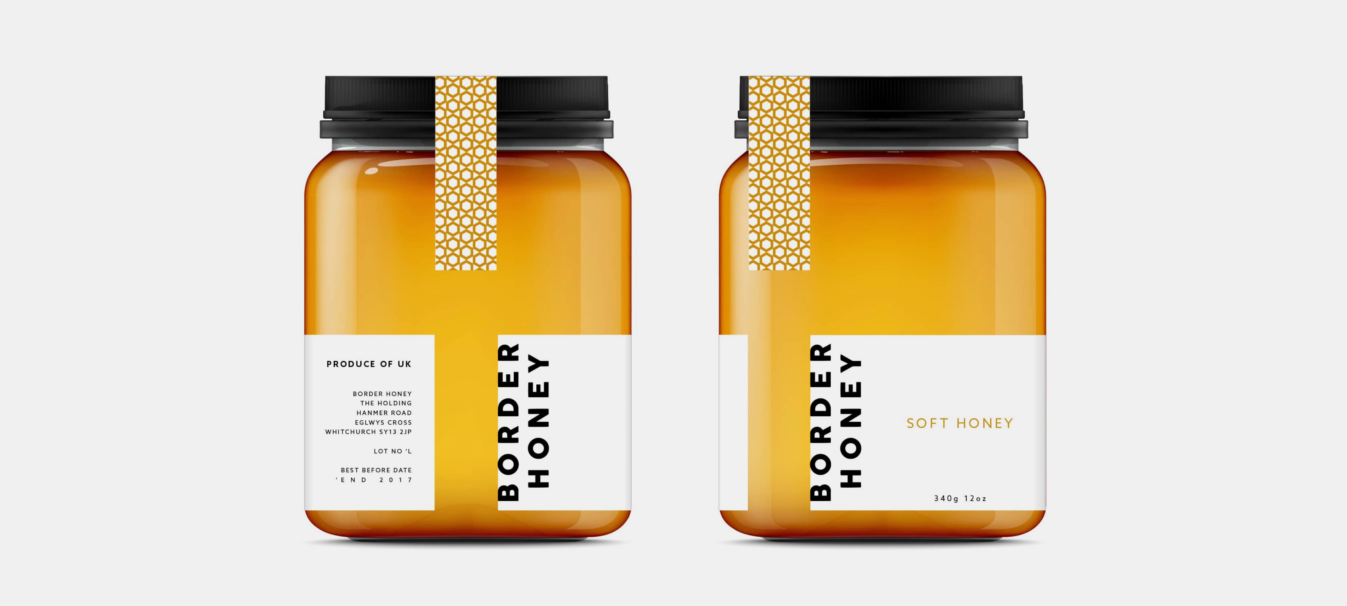
Border Honey were in need of a standout brand and packaging design that reflected the superior standing of the product.

What we did

Read our Eat Marketing case study on Border Honey.

With a focus on supplying premium, locally-sourced honey to honey packers and honey lovers, Border Honey needed a new brand design that would resonate with their target audience.

By using golden tones, bold black font and the hexagonal shape, Border Honey now has a brand and range of product labelling that expresses the luxury yet humble nature of their honey.

Read our Eat Marketing case study on Border Honey.
Maria

Similar project in mind? speak to Maria:

hello@eat-marketing.co.uk
0845 835 4661

Educate your inbox

By clicking 'Subscribe', you agree to receive marketing emails from Eat Marketing. Read our Privacy & Cookie Notice

Eat Marketing