Lewis Holloway Head of Design
When it comes to your food packaging design, what does your packaging say about you? Are you conveying the right message through design to get the sales you want? We’re here to help you with our easy to follow Do’s and Don’ts when it comes to your food packaging design.
Products need great packaging. Consumers are motivated by clear, attractive designs that catch their eye and motivate them to make impulsive choices. With food packaging design, the proof really is in the packaging. What consumers see and subsequently feel, can make a huge difference when it comes to purchasing decisions. Creating food packaging with impact will lead to powerful associations between the audience you’re trying to capture and your food business. You can immediately show them through packaging design how delicious your food product will look and taste.
At Eat Marketing, we understand that food product packaging is such a crucial design discipline, and we spend a lot of time on this element when it comes to branding for the food companies we work with. Strategically, your branding is so important when it comes to marketing your products, and initially, clarity is key; what your food product is for and what you, as a brand, want to convey through your food packaging design.
Whether you already have food packaging design in place, need a re-brand or are just starting out, you can see, there’s a lot to consider if you want to create impact – and sales! Take a look at a few of our do’s and don’ts to help you along the way…
DO Keep it simple, keep it honest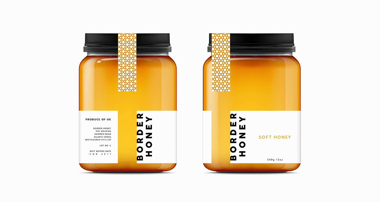
Your food packaging design should show the product contained within – clearly and effectively. If a consumer looks at your packaging and cannot identify what you’re selling, they are likely to walk on by. And that goes for an honest depiction of what you’re selling too… for example, beautiful food photography is important but it must be true to how the food inside the packaging looks. So, always be straightforward about what your product is with clear, clean design, font and wording and beautifully taken, yet honest, photography or illustrations.
A great example of simple and honest food packaging is Border Honey, a local premium honey brand, whose packaging expresses the luxury, yet, humble nature of their honey brand. If you were to take a glimpse at their product you’d know exactly what it is that they’re selling and the quality you can expect from the packaging alone. With a stripped back look to appeal to the target audience, golden tones and bold font, their packaging design speaks to honey lovers far and wide. Now that’s what we call powerful food packaging design.
Made Coffee is another brand that appreciates that less is more. Their packaging is the definition of clean and simple, there’s no second guessing what their product is and there’s no over-exaggerated images or illustrations so you know exactly what to expect.
DON’T Design / text overload
Beware of design and text overload… When there’s too much going on, whether it’s in the design or the copy, consumers won’t know where to look and they’ll simply switch off. This can apply to the fonts used too; don’t use different types of fonts as simplicity is key.
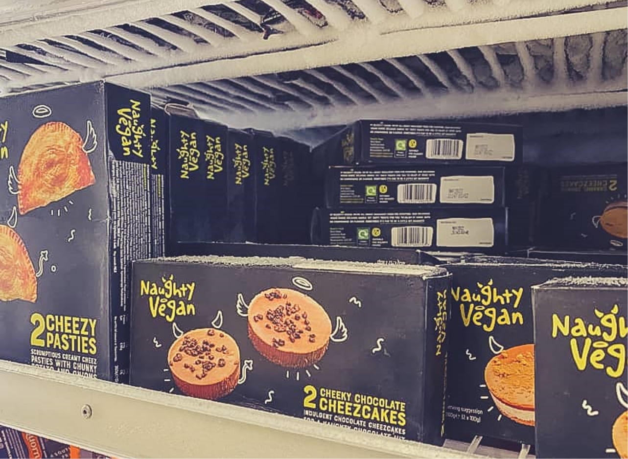
DO Take the shelf impact test
The next time you’re in a supermarket, take the shelf impact test… if your food product is competing against other similar products (and even if it’s not on a ‘shelf’ think of this in terms of competitive businesses selling similar food products to you) you want your product to attract attention. This can lead you to thinking about what you can do in terms of creating a strong, distinctive food packaging design that stands out from the food crowd. Yet, stick to the ‘keep it simple’ rule as these types of designs are more likely to catch the eye when people look.
Naughty Vegan, a devilishly delicious vegan brand, knows all about standing out on a shelf. Their innovative, award-winning packaging, markets their vegan products in a creative and revolutionary way compared to their competition. With the products on their packaging donning halos, devil horns and angel wings, they’ve played on their name and gone all out to ensure they stand out, which they certainly do!
Coca-Cola, a household name, is a great example of how important it is to develop a brand identity with effective food packaging design. Over 100 years, the Coca-Cola packaging has never swayed too far from their original packaging, simply updating it throughout the years, but never changing what fundamentally makes it recognisable.
DON’T be wasteful
Once again, we’re emphasising the importance of showing environmental awareness through packaging design. With food, packaging is immediately disposable and the more environmentally friendly it is, the better. By this we mean, really consider how much ‘packaging’ you need for your products and don’t go for designs that use unnecessary, wasteful packaging.
DO Choose the right food packaging material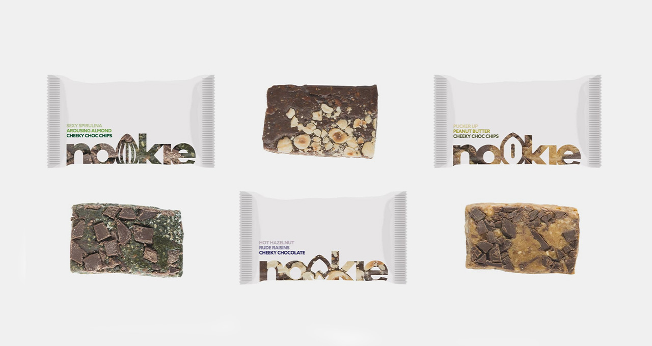
When it comes to food packaging design, the materials you use matter as much as the design you create. Of course, you need to consider what materials will keep your food fresh, whether you’re packaging hot or cold food and what will keep it contained without leaks or damage, but looking at biodegradable (yet sustainable) food packaging design is important too. In fact, 7 in 10 (that’s a high 72%) of consumers choose to buy products based on their initial attraction to packaging design according to a study conducted by the Paper and Packaging Board.
Delve a little deeper into the reasons why and you’ll discover it’s not just the design that counts, it’s the material too with 67% of consumers influenced by packaging materials. Going further, 71% of consumers are more likely to choose paper and cardboard packaging than other materials such as plastic. Consumers are becoming increasingly environmentally conscious, and as a food company, considering your food packaging design in these terms, as well as how it looks, could have a positive impact on your sales.
Take natural chocolate bar producers, Nookie, whose eco-packaging matches their overall natural brand. This helps them stand out against the crowd and attract consumers who favour sustainable packaging.
Oatly, the plant-based drink brand, are all for sustainable packaging. Their eco-friendly mindset doesn’t just stop with their packaging it encompasses their whole brand as they showcase themselves as a brand built on the idea of change and sustainability.
DON’T Do Difficult design
Consider how ‘easy’ your packaging is. There can be a temptation to try and create fancy packaging in the hope of standing out from the crowd, but it’s so important to have practical, easy to use and easy to open packaging that works for your product.
As you can see, good food packaging design is more than a pretty design. If you want to know more and take a fresh new look at your food packaging design or are just starting out, we can help.
Need some professional expertise?
Be inspired by how much further you can take your food business with the right food packaging design.
Get in touch with us today