Lewis Holloway Head of Design
When it comes to showcasing food in your restaurant or takeaway, it all starts with great menu design. After all, your food can taste wonderful, but you’ll need to encourage your customers to try it first…
At Eat Marketing, we’re fascinated with the psychology behind menu design and the impact a well-designed menu can make, when it comes to boosting profits and even steering customers to certain food choices.
But what makes a great menu? And how can you ensure that your menu fits your brand and pushes profits?
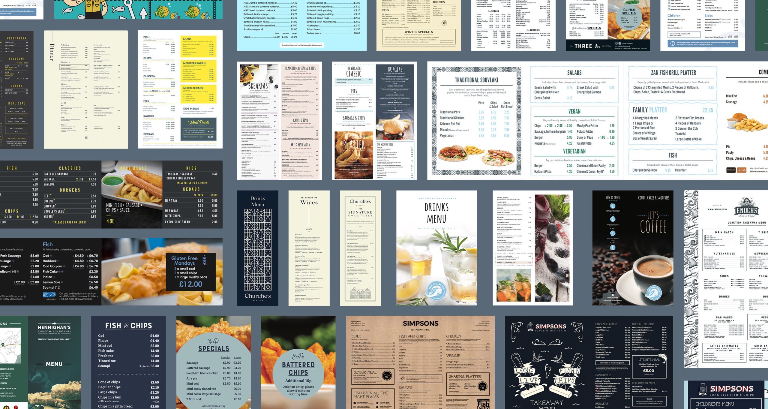
Over the years, we’ve worked with a range of businesses within the food industry from high end restaurants and food chains to friendly cafes and tasty takeaways. They’ve all had one thing in common when it comes to their marketing strategy – the need for a menu that not only reflects their brand, but that showcases their food.
Our creative team loves designing menus and showing our clients what a difference good menu design can make.
One of our designers, Scarlett, to give you an insight into the psychology behind great menu design and how we’ve implemented some of these ideas into our clients’ own marketing strategies.
On brand, on colour
We believe in a strong brand presence and this should follow through to your menu. Eat Marketing’s Graphic Designer Scarlett, advises sticking to your brand colours but also consider what kind of vibe you’re giving:
“For example, if you’re offering freshly cooked food with an emphasis on the fresh ingredients you use, green is a great colour to use. Or if you want to create a happy mood and catch your customer’s eye, consider a splash of yellow.”
When it comes to stimulating the appetite, and tapping into hunger, red and orange is often used (fast food places in particular like these ‘active’ colours) to get customers ordering.
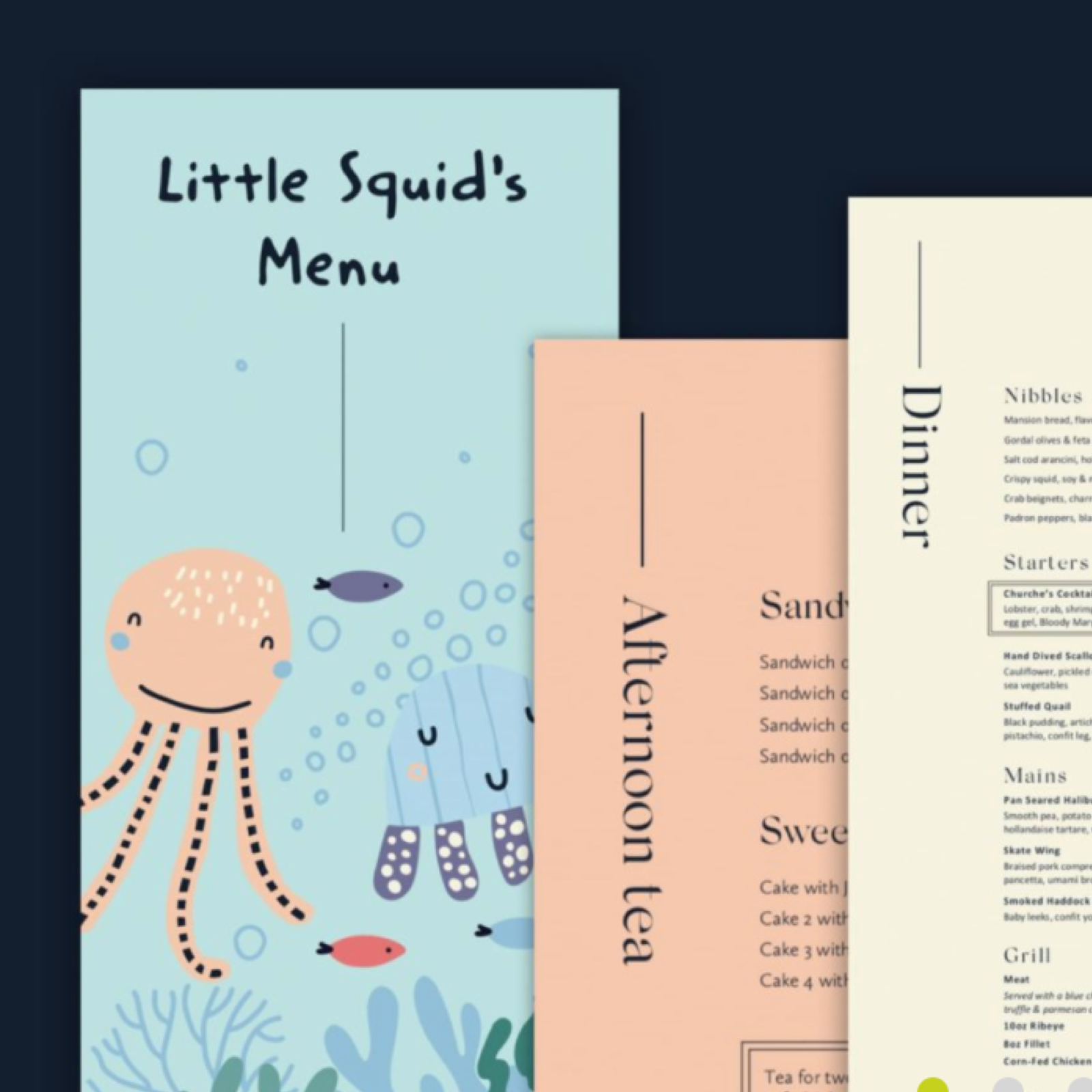
Great visuals

When it comes to designing a menu with impact, Scarlett recommends using tasty images of the food you serve in the form of a photoshoot rather than just using stock images:
“Taking the time to have your food photographed adds a personal touch as it not only shows what your food actually looks like, it avoids any mis-selling.”
Here at Eat, we really enjoy incorporating food photography into a customer’s menu design strategy and once done, there’s so many more design techniques we can put in place to ensure any photography is used to its best effect.
For example, when it comes to adding photography to your menu, especially if your menu is limited on space, using an image with a background colour to overlay text on top can work really well. We used this technique to great effect for our client the Wigmore Restaurant.
“The Wigmore also needed a coffee menu, and we created an effective front cover by using a wraparound image with full photography which was incorporated into the whole menu experiences,” Scarlett says.
Whilst great photography is very powerful when it comes to menu design, Scarlett believes it’s important to note that too many images can overwhelm customers and take away emphasis from where you may want it the most:
“With visuals, it’s worth taking the time to really play around and have fun with your design. Considering how it would work across digital platforms is also important and is something we always take into account within the creation process at Eat.”
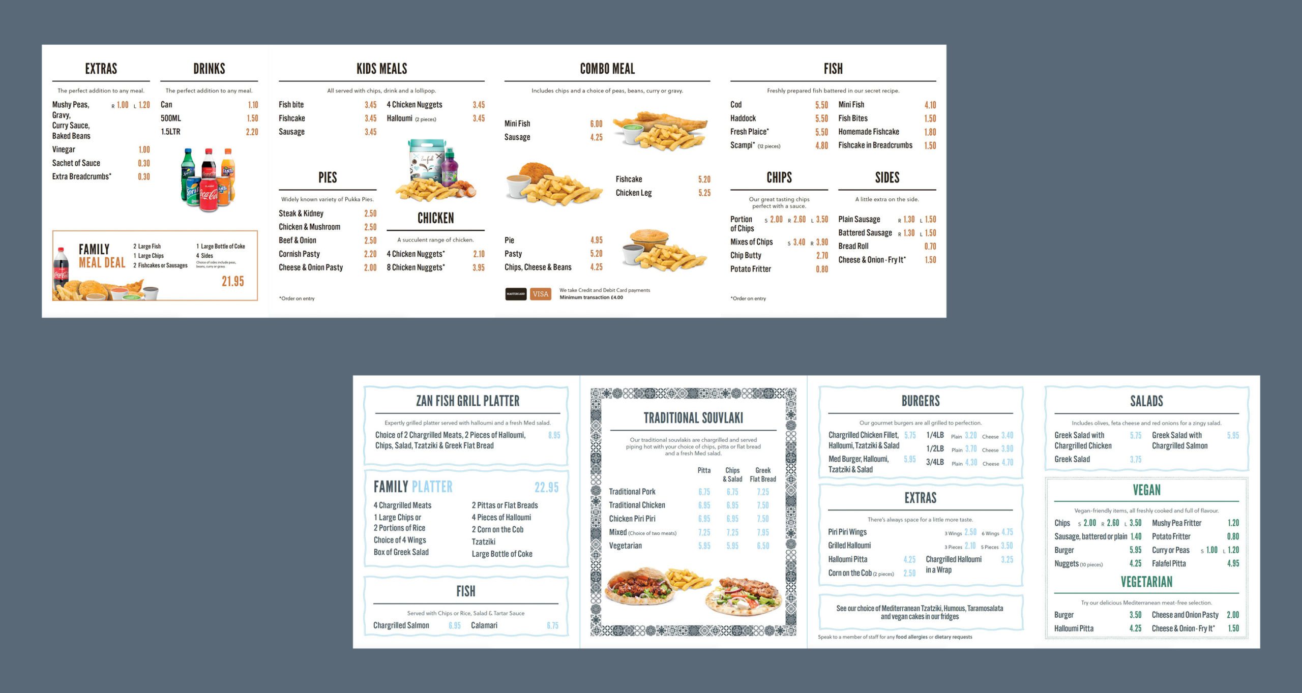
Food options
The less is more approach also extends to how many items per category are listed on a menu. This is why you’ll often find around seven foods per category. This gives customers enough to choose from, and perhaps try something instead of their ‘go to’ choice, but not too much to feel overwhelmed by.
Perfect positioning
When we look at a menu, our eyes are naturally drawn to certain areas. For example, menu designers often talk about the ‘Golden Triangle’ which refers to three areas our eyes will automatically move to.
This is why restaurants place the food items they want to sell the most in these areas, as well as highlighting them with bigger, bolder text.
Other techniques include using boxes or frames, grouping items together and cross-selling (positioning and pairing certain wines with certain dishes), using colour and adding illustrations.
Write it right
Good copy sells, and when it comes to food, good copy goes straight to our taste buds! Using appetising and appealing descriptions will have more appeal than simply listing dishes or even drinks such as wines.
For example, words such as ‘succulent’, ‘home-baked’, ‘locally-sourced’, ‘farm-raised’, ‘tender’, ‘hand-dipped’, and even words such as ‘satin’ (to describe a chocolate pudding perhaps?) can be used to great effect.
“Using quotes from the chef or managers can also be a very powerful addition to a menu, especially when it comes to upselling more expensive items,” Scarlett says.
“Customers tend to be more invested in a dish or drink and are more likely to try it if they believe it has been recommended or well-considered by those in the know.”
These are just a few ideas when it comes to menu design. There is so much fun to be had when creating the ideal menu for your food business so, if you’re keen to explore how a great menu design can boost your profits, talk to us today and discover how we can help.
Creative menu design
Drive interest to menu items you want to push with a professional menu design that’s inline with your tone of voice and promotes your services.
Discover more