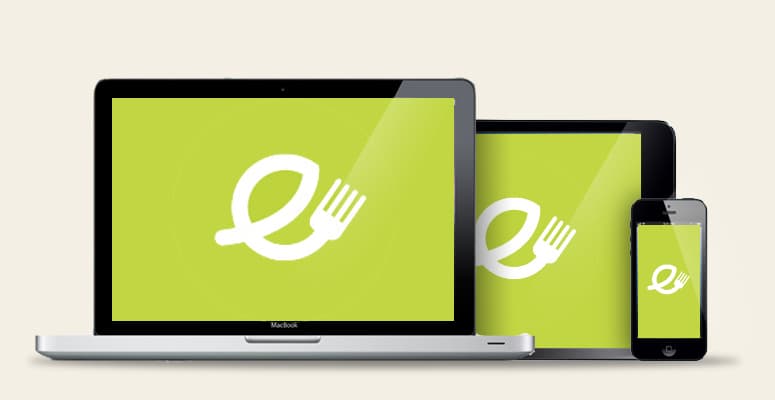
Have you heard of responsive web design? The continuing demand for different internet enabled devices (especially smart phones and tablets) means more and more businesses are asking for responsive design for their website as this approach creates a web page that ‘responds to’ or ‘adjusts’ (resizes) itself depending on the type of device being used. This also means a business will need just one site – and the different elements will respond differently depending on the view, whether it’s on the monitor of a desktop computer, a laptop, a tablet or a smart phone screen.
Responsive design is also good news when it comes to search engine optimisation; Google recognises and rewards online websites who cater for the ever-growing mobile user population, which means using responsive design is a clever way to be one-step ahead of your competitors!
At Eat Marketing, we have really noticed a growth in food businesses looking at responsive design, so now is a good time sit up and take notice of what this could bring to your food business. When it comes to food, your potential customers want to be able to read about you, look at your menu and find where you are quickly, efficiently – and whilst on the move.
For a better idea on just how great responsive web design is, take a look at some of Eat Marketing’s case studies:
https://wigmorefishandchips.com/
https://www.richardsonsfishbar.co.uk/
https://queensfishandchips.co.uk/
This cool functionality will set you apart from your rivals so talk to us today about responsive design and see how we can help you adapt your website to the hottest website trend of 2013!


